
HOW DID THE WEIRD DESIGNS OF THE COURT CARDS COME TO BE (WITH THEIR SEMI-CIRCLES AND DIAGONALS)? Are they based on real people? There are lots of myths and they are mostly bollocks. The cards do not represent Caesar or Charlemagne. Or particular kings and queens (they are generic). Nor the seasons. The King of Hearts is not the ‘Suicide King’.
The king may appear to stab himself (he originally held an axe) but it’s a feature of early French decks, a result of design evolution. Jacks evolved from Knights, and the ‘Knave’ (servant) was simply replaced by the ‘Jack’ in English decks.
The suits originally symbolised social classes (nobility, clergy, merchants, peasantry),
but became stylised, simplified – so they could be stencilled which allowed for easy
and wider appeal.
When playing cards arrived in Europe in the late 1300s, they were hand-painted and ruinously expensive; but the printing press changed everything. Rouen in the 15C became an important and influential centre for card-making. Their cards were a cocktail of features from various foreign markets, so whatever significance they had was blurred. Rouen’s cards were exported
to England and became the model for English published packs. When England banned the importing of cards in 1628, English printers used Rouen court cards as their inspiration. The style of the costumes on English playing cards is thus late medieval, a direct descendent of the Rouen models, but tweaked over time; the geometry is now meaningless.
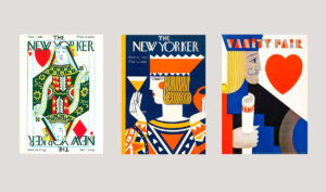
The COURT CARD has become a sort of design classic, as these vintage magazine covers show. Two of which will feature in our forthcoming pack, celebrating ART DECO.
Despite their apparent simplicity, court cards were never designed as literal portraits but as flexible graphic devices that could be reproduced efficiently across regions and centuries. As printing techniques improved, especially with woodblock and later copperplate methods, card makers prioritised clarity and recognisability over realism. This is why the stylised symmetry, bold outlines, and mirrored diagonals became so prominent—these features ensured that the cards remained legible even after repeated stencil reproduction and rough handling during gameplay.
Over time, different European regions developed their own visual interpretations of the standard court card structure, but the French model ultimately became dominant due to its export success and printing efficiency. The distinctive English pattern, still widely used today, is directly descended from these French prototypes. What we now recognise as the “standard” King, Queen, and Jack design is therefore not an original artistic conception, but the end result of centuries of commercial adaptation, simplification, and cross-cultural borrowing.
The geometric distortions often noticed in court cards—such as asymmetrical poses, duplicated facial profiles, and reversed weaponry—are not symbolic codes but practical compromises. Early printers worked within strict technical limitations, and designs had to be split into multiple blocks for colour application. This process naturally introduced irregularities that later became embedded as part of the visual language of playing cards. What appears today as intentional abstraction was originally a by-product of industrial necessity.
By the 18th and 19th centuries, playing cards had become mass-produced consumer goods rather than luxury items, and their designs were increasingly standardised across Europe. This standardisation helped reinforce the recognisable “court card archetype” that persists today. The figures became cultural placeholders rather than individuals, embodying generic ideas of royalty, authority, and service rather than specific historical identities.
In modern times, court cards have transcended their original function entirely and entered the realm of graphic design, fashion, and visual culture. Their bold composition and balanced symmetry make them ideal for reinterpretation in decorative arts, advertising, and contemporary illustration. This enduring adaptability is part of why they remain so visually compelling—they sit at the intersection of utility, symbolism, and pure design abstraction, unchanged in essence for over 500 years.
syj70z